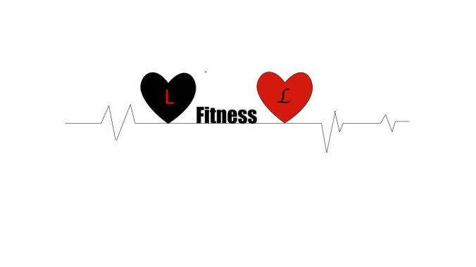
Here is my completed draft for my logo! It is a very rough draft, as I just mainly wanted to see what I was able to do on Illustrator. My inspiration for the logo was thinking about health, and how important it is for your heart that you remain healthy. I automatically thought of a heart beat and how your heart rate increases when you exercise. I also thought that in many ways the heart represents life, and how when I think about “living,” I think of a beating heart. It also tied in with the word “loving,” as a heart is the symbol for love. The slogan is “Living and Loving Fitness.” I put just the L’s rather than the entire words, as I was hoping that it would be symbolic enough, as logo’s are supposed to catch on to represent a brand, rather than be lengthy. I experimented with making shapes on this logo by using the ellipse tool in illustrator, and I used the line segment tool for the heart beat. I already had experience using fill and text, so that was just incorporating previous knowledge.
For my final project I want the design to be less spread out, and a bit more aesthetically pleasing and put together. I am pleased with the colors I chose and how I reversed them for each heart, I am also pleased with the font choice. For my final project I will also probably remove the strokes from the hearts, and play around with the line thickness of the heart beat. I want the logo to stand out a bit more and be a bit bolder and so I will be looking for ways to make the hearts a little more defined, perhaps with an effect.
Overall, I am happy with how this turned out. I find illustrator very complicated and so I was proud of the fact I was able to make a design that was effectively put together.

Hello! I really enjoy this blog theme and looking at what you have done so far I appreciate the direction you are going with it! I also think you’re on a really good track when it comes to making the different project designs. When thinking of health and fitness I definitely also consider a heartbeat to be one of the main visual concepts. I like the design with two hearts, however the changing of the two fonts between just one letter seems a little unneeded. However, if the heartbeat lines were made somehow to represent a slow heart rate that changes to a faster beat (to symbolize exercise) then the different fonts would fit really well! I see a lot of potential especially since it is only a rough draft. I think you have a strong idea when it came to only using the L in the heart rather than the entire word, it helps keep the design a logo and not another poster/brochure.
LikeLike
Hi Jennifer,
I think your logo design is very clean and simple, I know your not done yet and I red what you said what important to you, so I think finishing it up it will look really cool. Your heartbeat illustration is great, it looks authentic and easy to understand what your business is about.
My only real suggestion is the maybe drop the heartbeat line that extends left of the first heart and let it run to the right, and also I think with any logo in some situation you may need to spell out he name somewhere? One last comment is to ask if you considered where this would be used? On a website, apparel, business cards? And if so, how will the logo fit on those items?
Cheers and great job!
Gary
LikeLike
Hey Jennifer,
I love that your symbolically used the hearts and put in ‘L’s’. I also really like the idea of using a heartbeat in the logo. I feel like the hearbeat line strokes could be thicker. It looks very thin and easy to miss. Also, the font could probably be different for the L’s. Other than these, I feel like this logo is a very strong idea and I can’t wait to see your final project. Good luck 🙂
LikeLike
Hi there! I really enjoy your blog and the idea behind this logo! I think that it is very clean and simple, which is something that I think is good when discussing fitness. A few things that I might do would be to spell out the words “Living” and “Loving” because I don’t think anyone would know what the L’s reference unless you were to tell them, by writing the words out you can avoid the confusion. Another thing is that I would make sure that the font of the two words/letters should be the same, I think its more professional that way. Besides these few things, I like that you have the pulse on there as well as hearts, I
LikeLike
***it gives the logo multiple different perspectives. Overall good job!!
LikeLike
For my final draft I would like to make this logo more cohesive. I want to make the heartbeat lines bolder, and spell out “Living” and “Loving” I also want to come up with a clear idea of what kind of merchandise I see this logo on. I love the color scheme, but I want it to be more aesthetically pleasing without being too complex. I want to take off the strokes of the heart and have them look more like they are coming from the heartbeat. I am still deciding if I like the placement of the word “fitness,” I believe that if I spell out the other words I may have to change the placement but it will all have to depend on the final product. I am also planning on refining and shortening the heartbeat to make it simpler.
LikeLike